Project Summary:
For this project, I was asked to design a task execution on a smart watch platform with the primary focus on microinteractions. I selected the option of "Creating and receiving reminders" on the Samsung Watch.
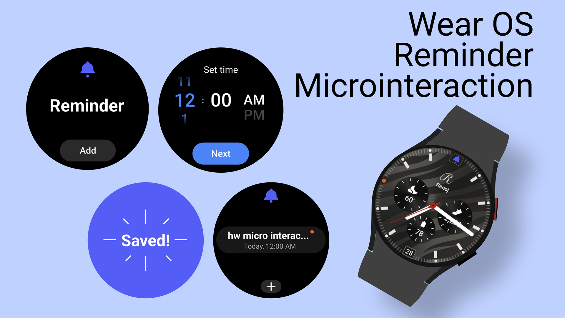
I used Figma to create the prototype of the microinteraction, which currently finishes the task confirmation with a pop up and a simple reminder animation.
Consumer Profile: Samsung Watch and Andriod WearOS usersRoles: User Interface Designer
Design Tools used: Figma
Design Research and Exploration
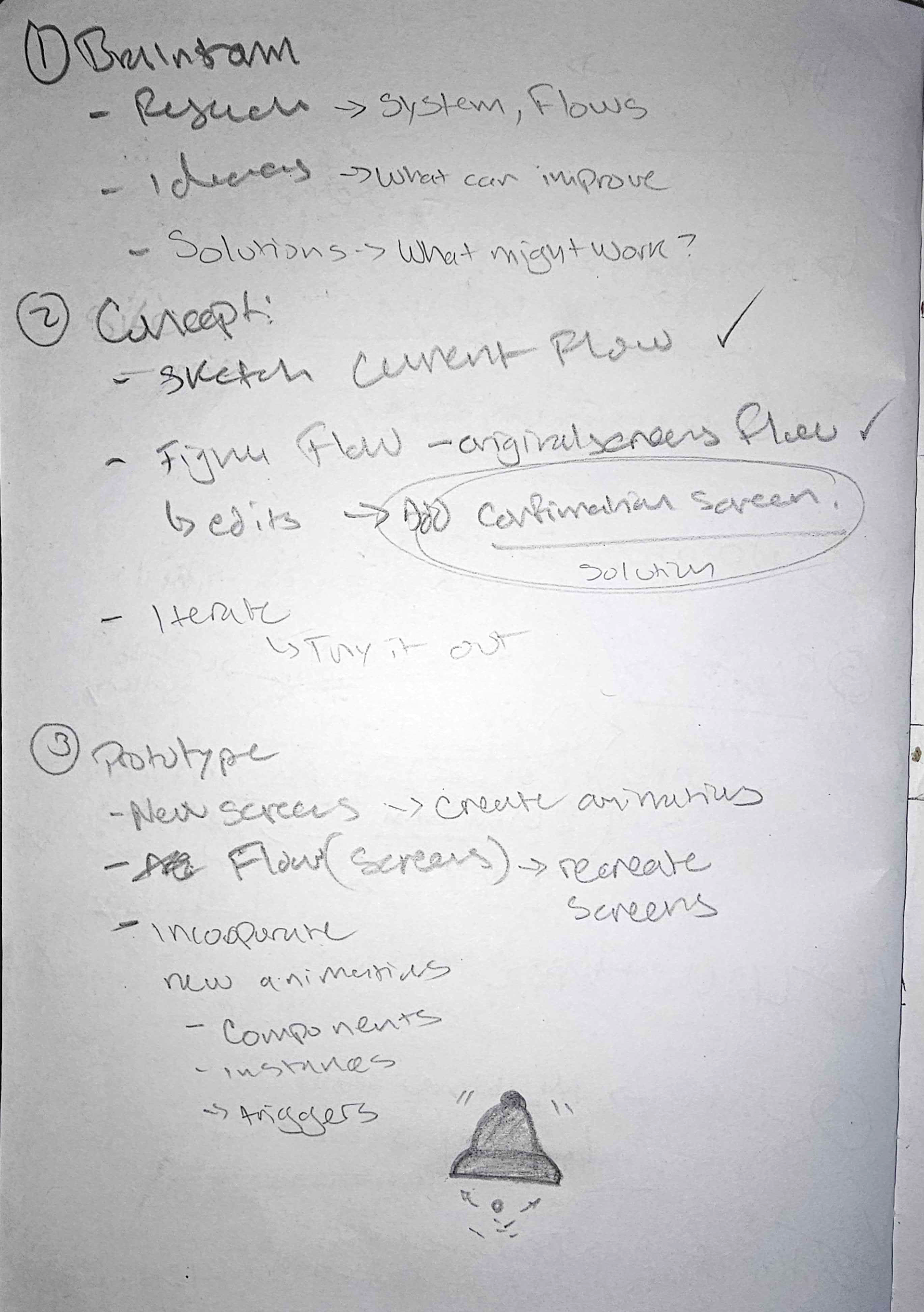
To begin my design, I decided to come up with a game plan of all the ideas floating to the top of my head. These were the steps that I laid out so I could follow some kind of process.
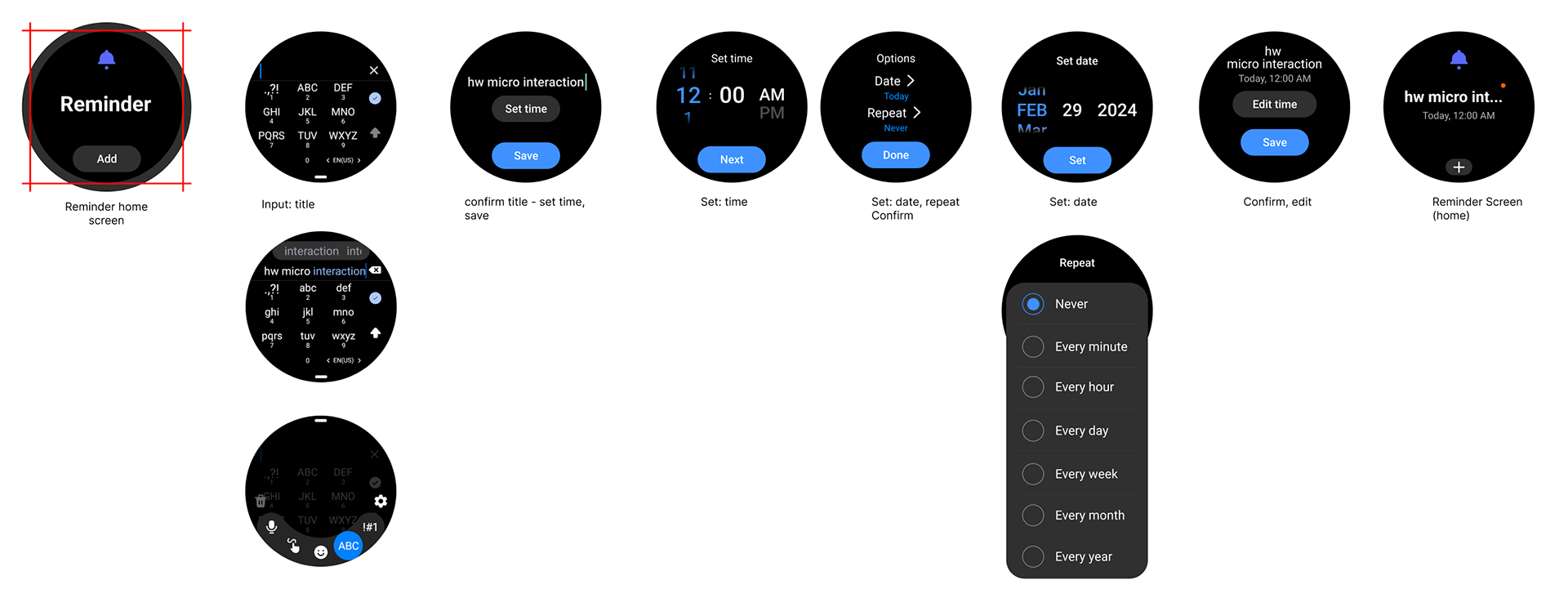
I also just wanted to get in there and start sketching out some ideas. But I first wanted to know how the Reminder app works and what the general flow of it was before I could start ideating.
Research
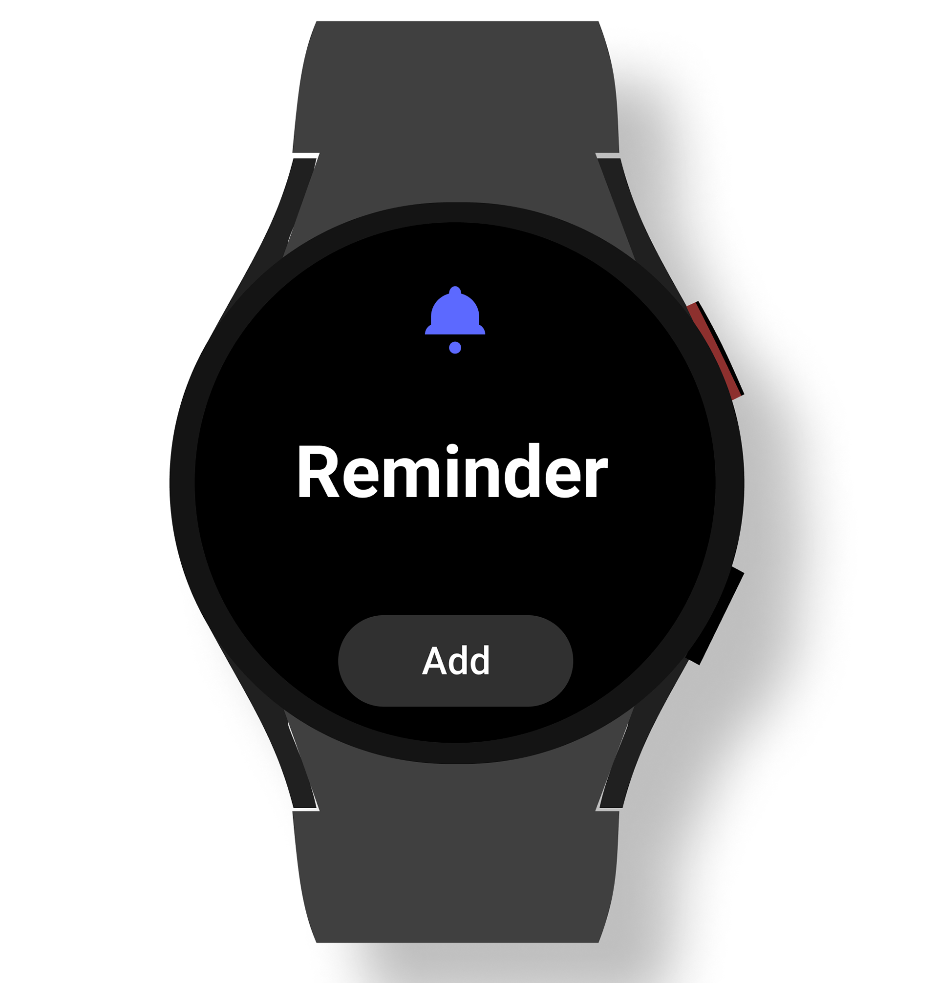
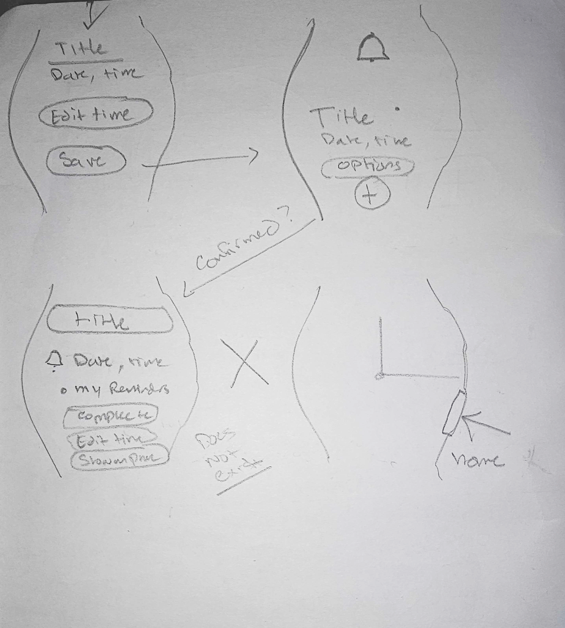
I have used the Reminder App in the past to jot down some trivial things that I knew I would forget later on in the day, I just never really paid attention to how it worked. So I carefully studied each screen and noted some of the key features that made this app work. This app was designed with the user in mind and taking the space needed to make a reminder. With constraints in mind, I understood why certain text and numbers were sized accordingly. After going through the entire flow, I realized that there was no confirmation or happy surprise when I created a reminder. It just sits there on the reminder screen with the user having to dismiss or click on the home button off to the side. This is what I wanted to focus on for this micro interaction.
The Design Process
With the general flow of the app in mind, I began to sketch out some of the initial ideas I had and also found some new ones. Here's what those quick sketches looked like.
Ideation
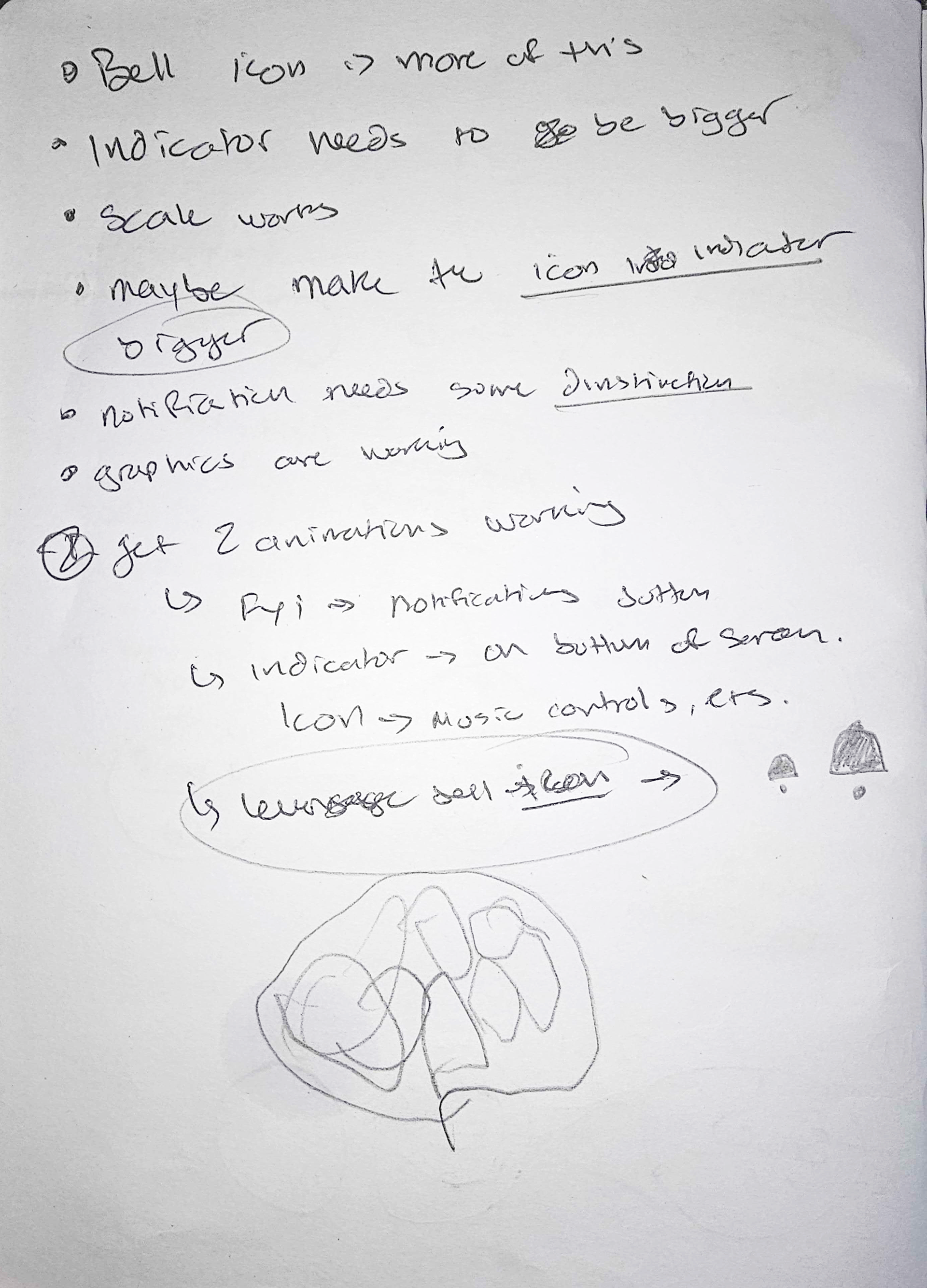
I noticed that there was no confirmation once a task was created, leaving the user on the main Reminder screen. I wanted to focus on the idea of having some kind of confirmation (idea #1) that notified the user that their task has been recorded. I also noticed a missed opportunity to include some kind of personality to the app by using the bell icon (idea #2), so why not give it some movement? Lastly, I wanted to incorporate the notification icon, an orange dot on the main screen, and have that be a quick way to bring back up reminders.
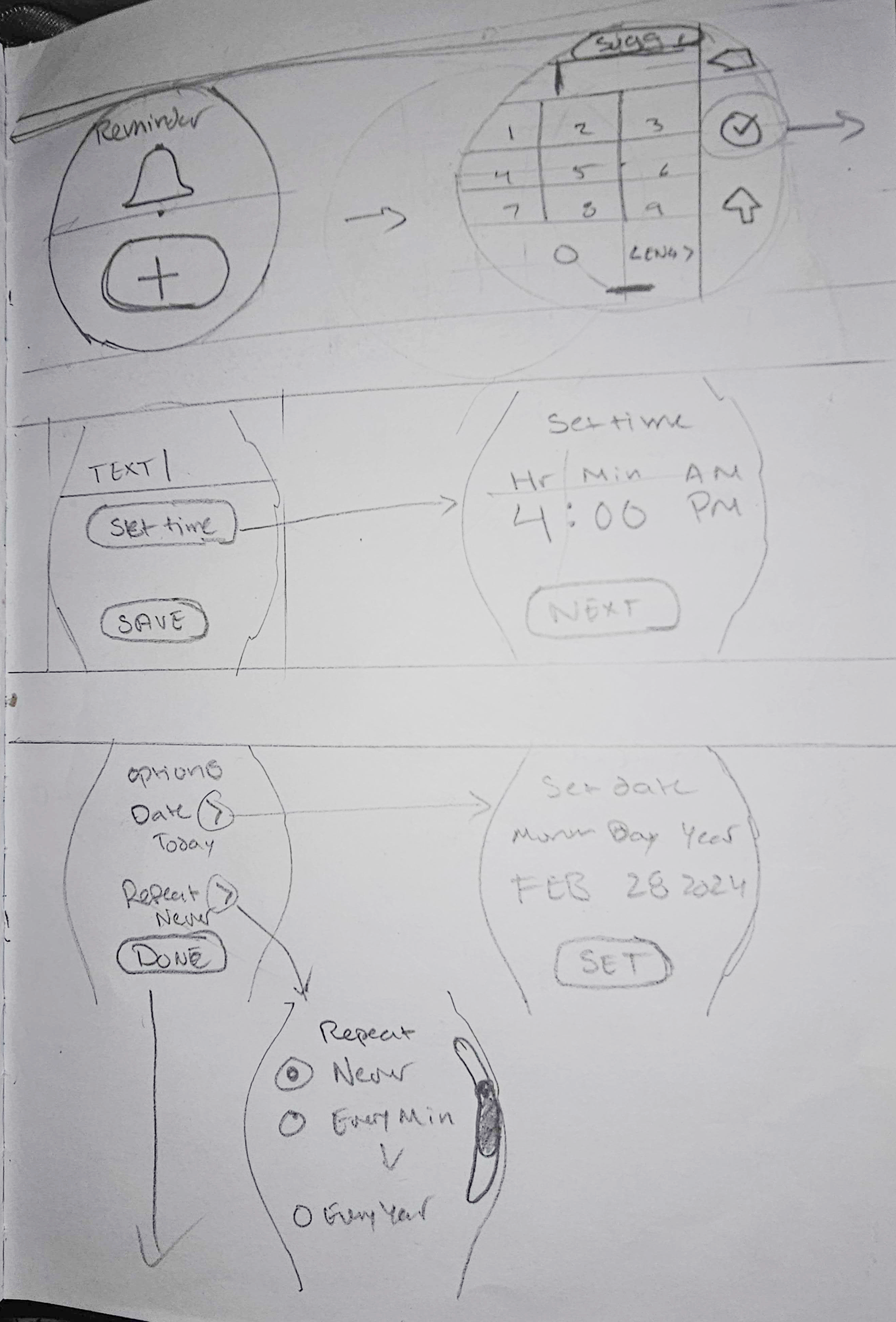
Understanding the flow
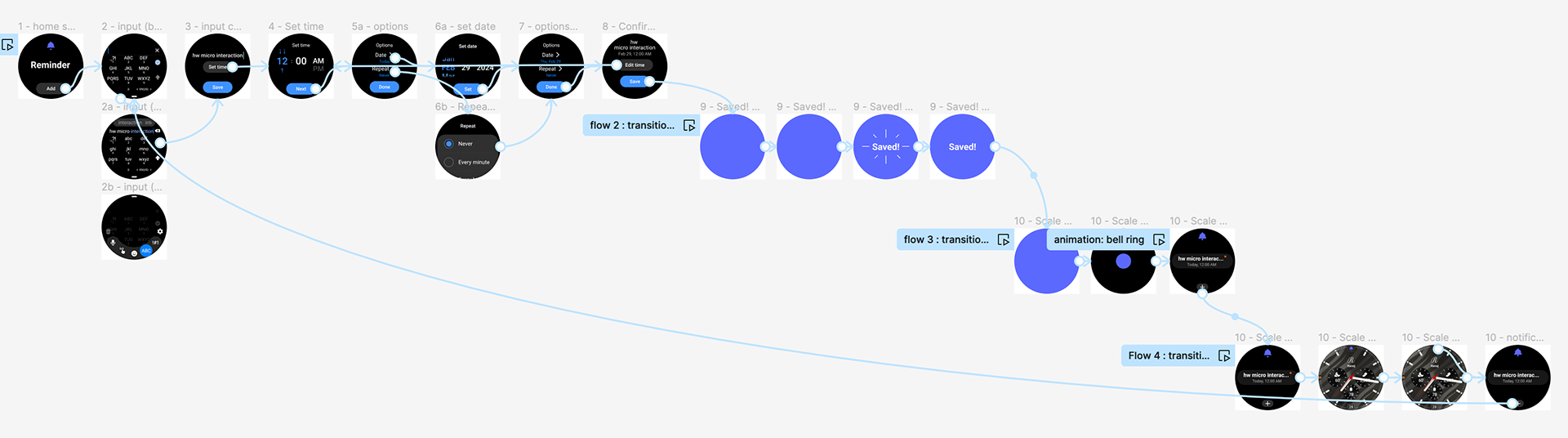
Once I had an understanding of the app and how the user flows through each screen, I began to see how the guides and rules worked for the WearOS system. Here's a breakdown of the original flow of inputing a reminder on a watch.
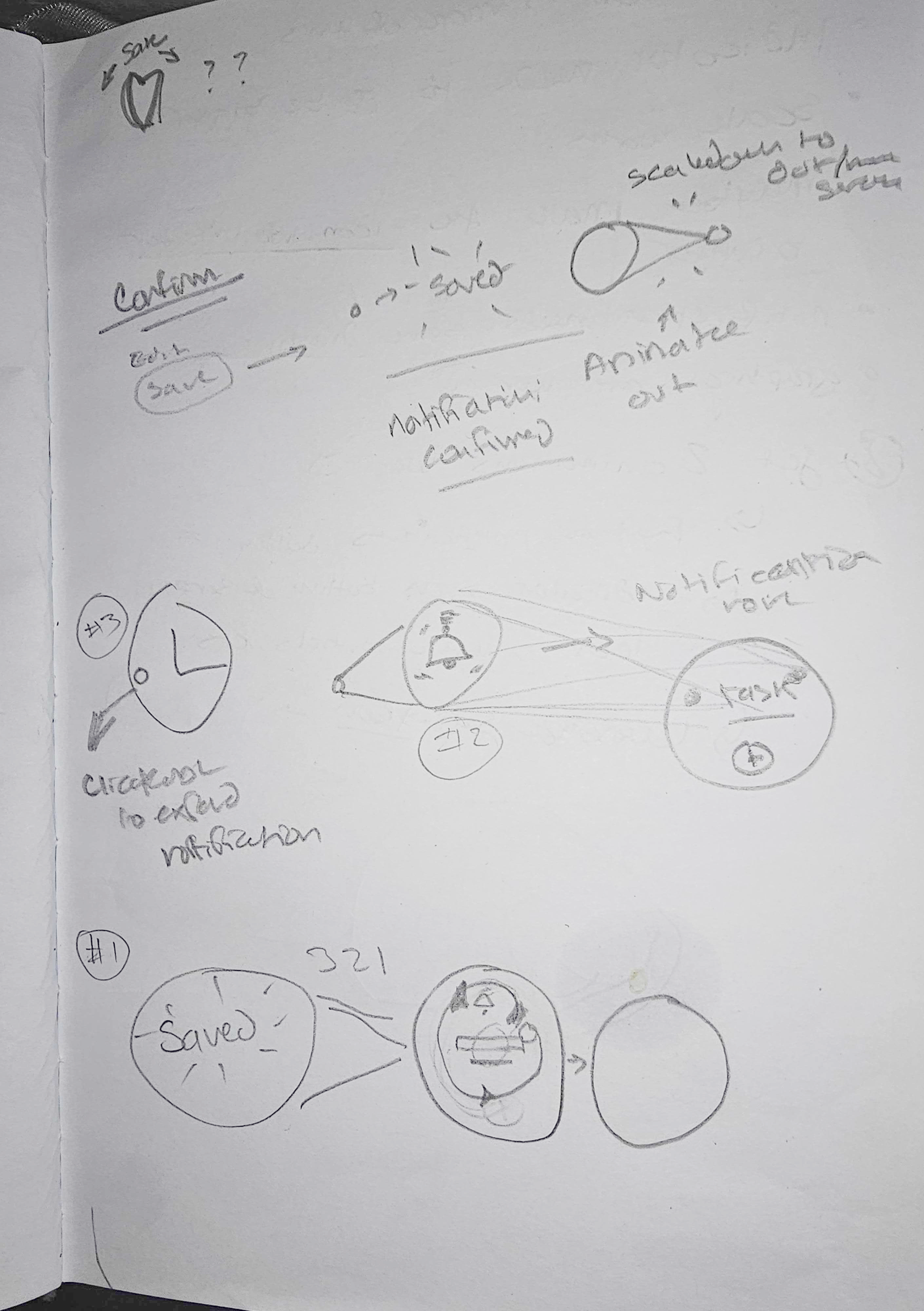
Once I had the screens into Figma, I started to play with some of the existing elements and working out how my first idea could work. Here's an early sketch of what I was thinking. I wanted an animation to appear once a user presses SAVE and let's them know their reminder has been recorded. I also wanted to remove the step of returning to main screen by having the application close and have an indicator on the main screen. Initially, I wanted to make use of the orange notification icon.
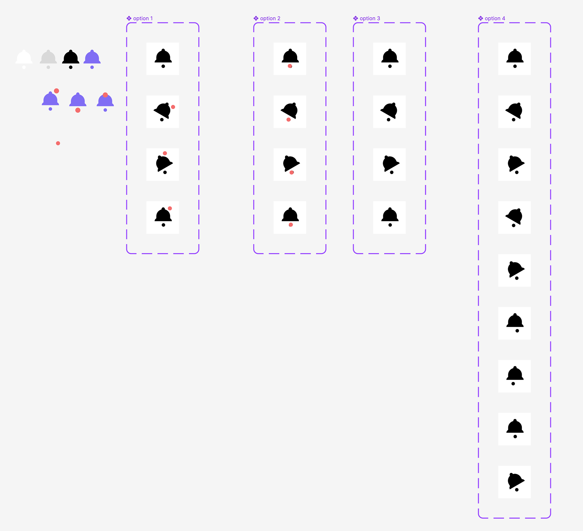
Idea #2 was the reminder bell ringing or having some kind of motion. Here are the initial ideas I had for the movement of the animation and some design options. The first iteration was very simple, moving side to side, with the last iteration having a bit more movement.
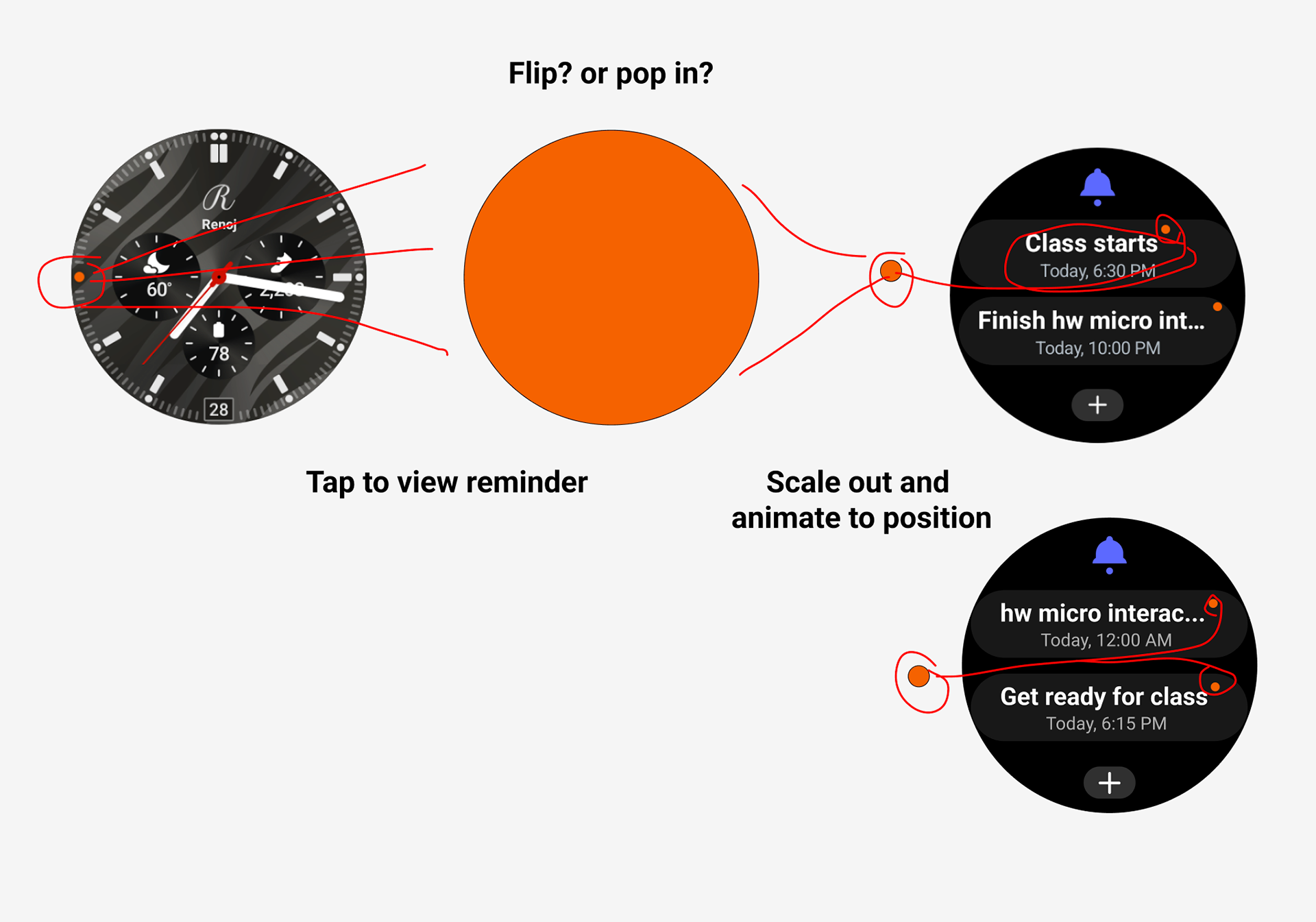
Idea #3 was to use the icon notification as part of the animation and confirmation process. In this case, the orange notification icon (dot) on the main screen would flip or pop in and go back to the reminder screen. Then the orange dot would move into the final reminder position. If there were multiple reminders, it would split and move to each one.
Feedback and user testing
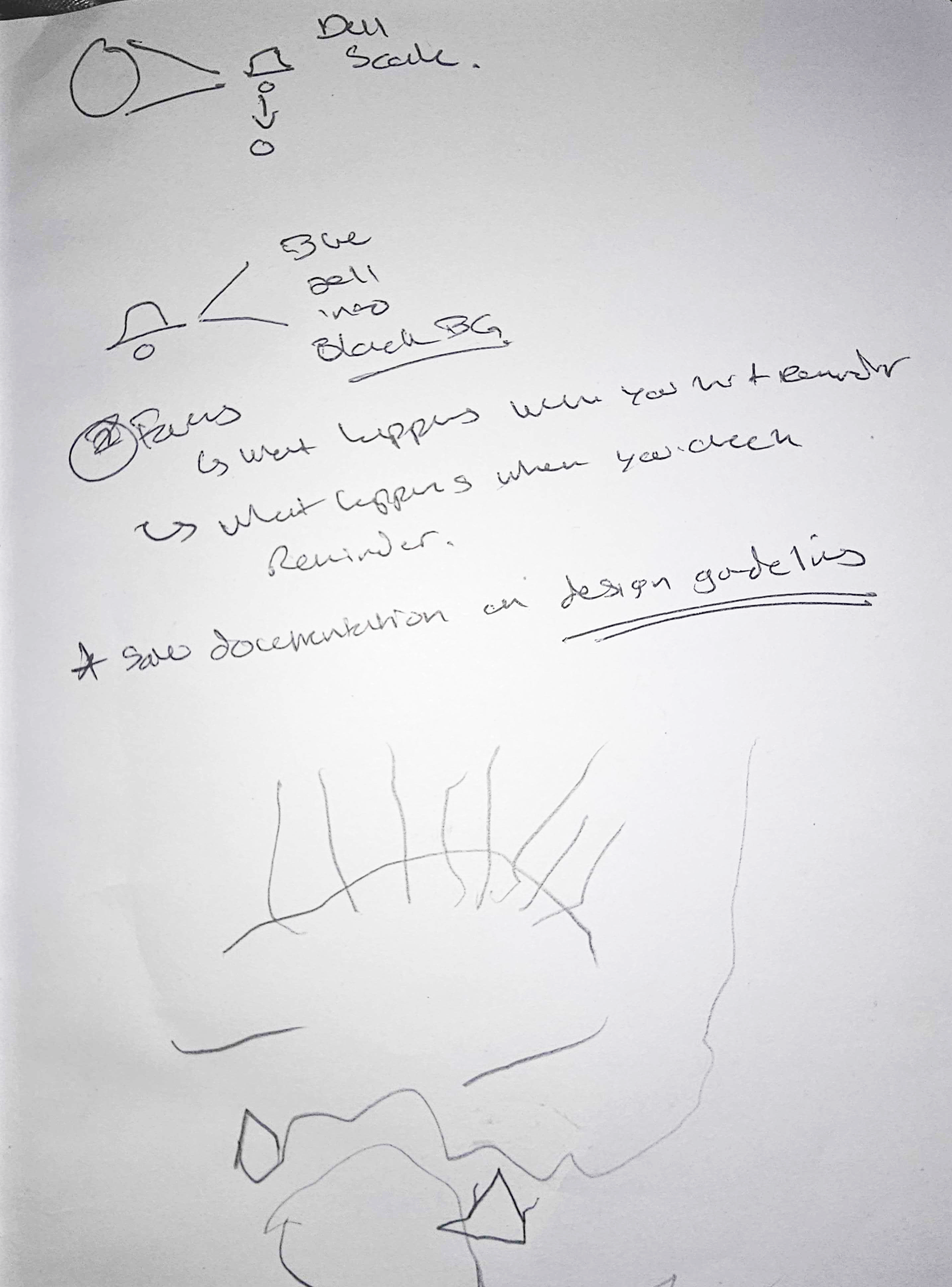
I shared my initial ideas with classmates and also had a friend see what I was going for to get some feedback. We discussed what worked and what didn't and I was able to walk away with some refined ideas. One of the things that was working was the Bell animation and that I should continue working on that. "Leverage the Bell icon!"
The other was to move away from using the notification icon and integrating it into the micro interaction since Notifications applies to many more things beyond a reminder such as a text, email or other types of notifications.
The Prototype
With the ideas flushed out and having some feedback, I was able to continue working on the things that worked. I wanted to make sure the Bell animation moved as intended. I also wanted to work on the transitions and how the icons would move into their final positions.
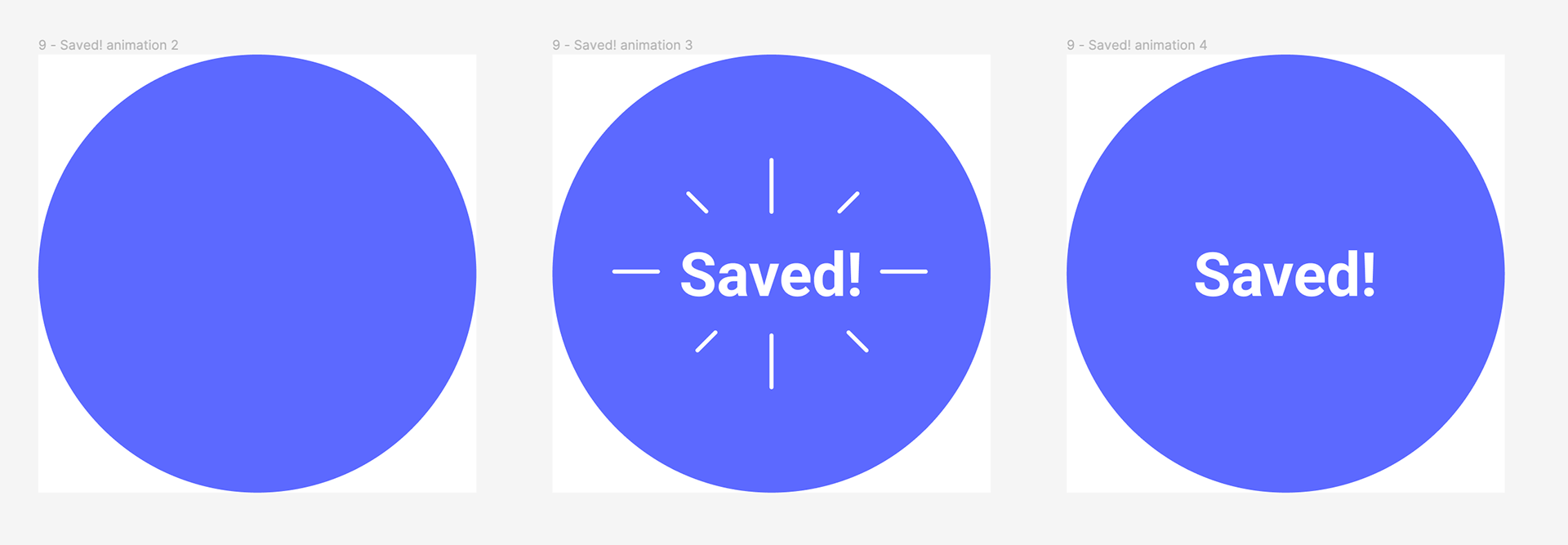
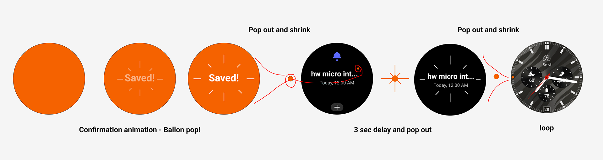
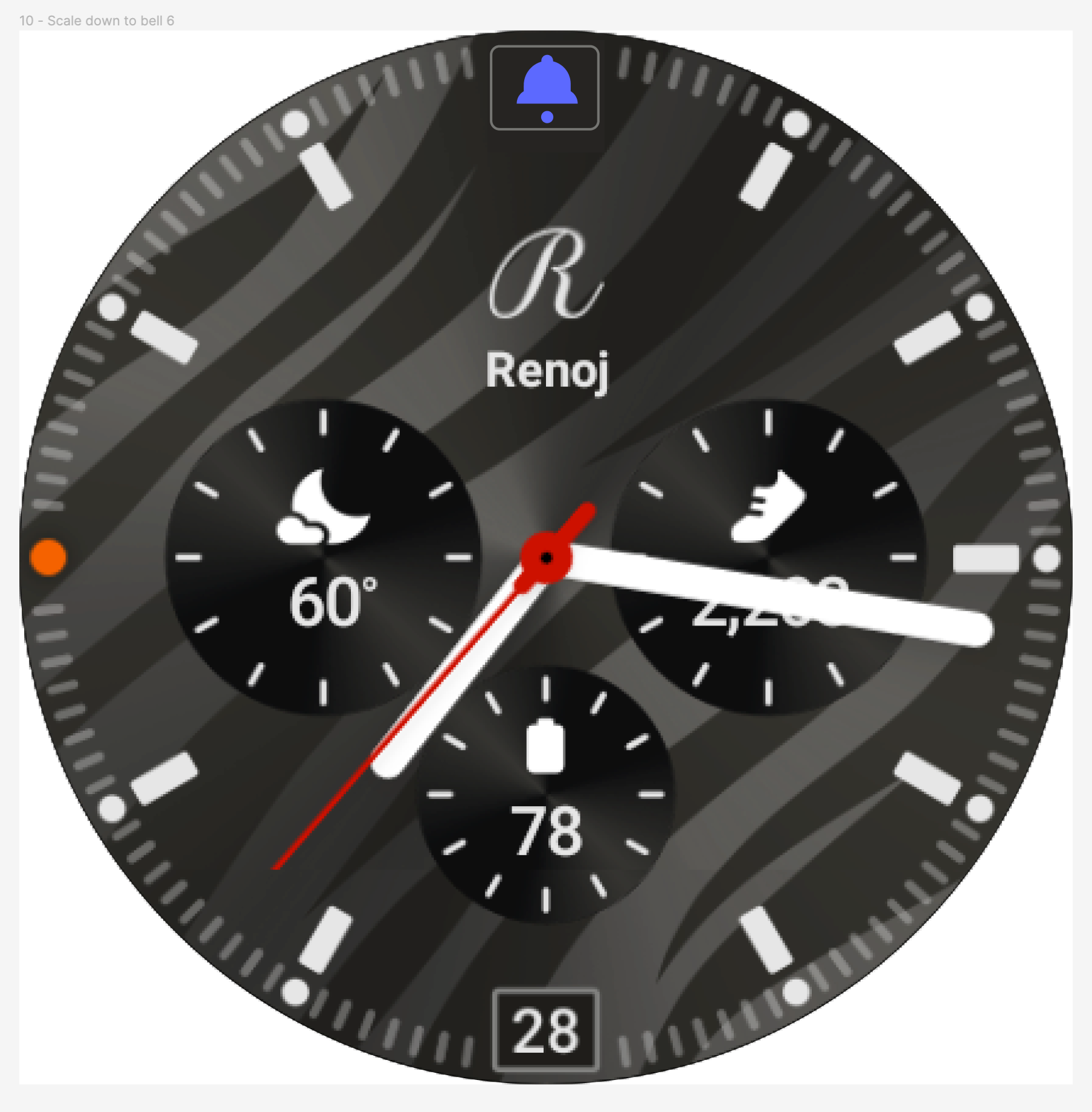
I moved away from using the orange notification icon and instead focused on using the existing elements of the Reminder app. This included using this violet color as the primary color for the transitions and the Bell icon. Here's a simple view of how the confirmation screen would look once a user saves their remind task. The screen would move in and the word SAVED with a few lines would indicate that indeed the task has been successfully recorded.
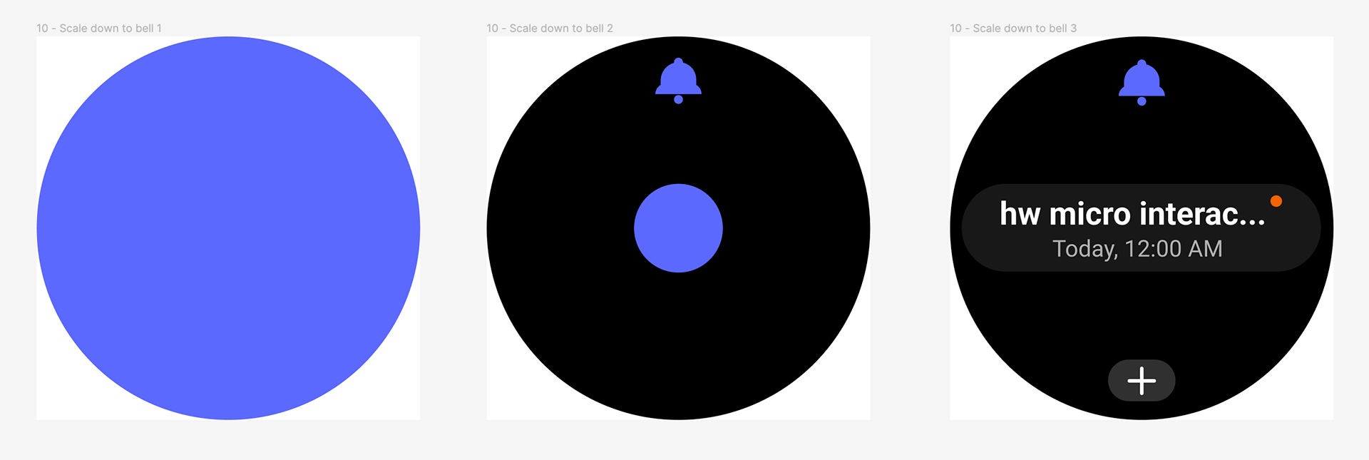
Once the word SAVED fades out, the screen would scale down and move into its final position under the bell's clapper, which is also a circle. After it moves into position, the bell moves as if it has been rung, providing another indication that this micro animation is complete.
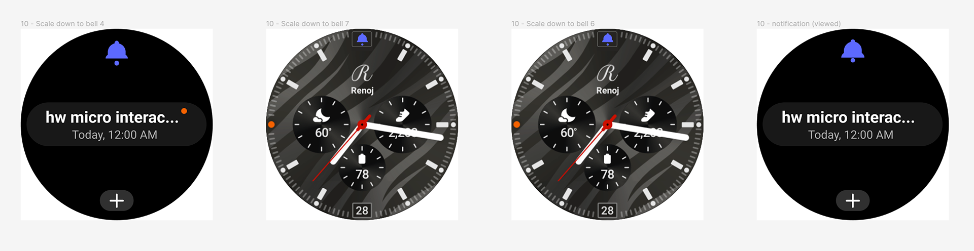
The final animation takes the user out of the app after a brief period of inactivity. The main screen moves back into position, but the Bell icon would move up to the NOON position. Currently, there is no action that a user can do by tapping that top portion because there's no use for it. Compared to the current active indicators such as fitness and media controls below, the reminder only leverages the notification icon to indicate active reminder tasks.
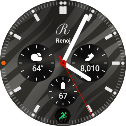
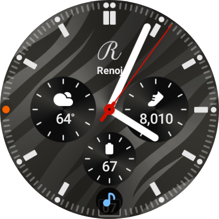
My proposed micro interaction would add a use to the noon position and moving the reminder icon to the top. A user would be able to view active reminders by tapping the bell icon and would be free to free up Notifications for other uses. This small change would provide the user a quick view of active tasks that they can view at anytime. Also, it doesn't block the date from view as the other icons due when they are active.
Try it out
Click on the button below to try out my final prototype of the confirmation animation, the Bell animation, and the final position on the main screen. Any feedback is always welcomed!