Email Redesign
Project challenge
In this project, the challenge is to redesign the interactions users have with desktop email clients - your outlooks, apple mails, and windows emails, etc. Look for the things we all use daily and expect to work seamlessly, but that have the power to disappoint and make a mountain out of a mole hill. Research the email clients and propose a new microinteraction to make the user interface a better experience.
The magic template editor view
Research and Analysis
03.17.24
SWOT Analysis
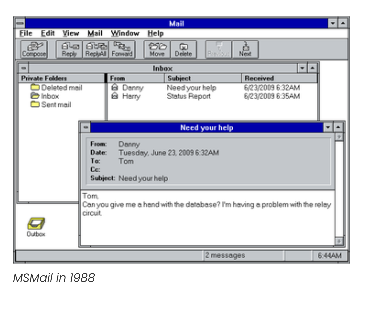
After reviewing several email clients, I focused on Gmail, Outlook, and Apple mail to conduct my SWOT analysis. I found that each of these clients have their own strengths and weaknesses, and what I walked away with studying these platforms is "different methods for different people". Here is what I found in my analysis.
Strengths
Gmail: static window on lower right, stays up when viewing other emails. Abandoned windows are saved as drafts. May be one of the most used platforms available for email.
Apple: free stand alone floating window. Audio micro interaction notifying user email has been sent. Exclusive and free for all mac and iCloud account holders.
Hotmail: better use of type options (font, colors, setting). Email Composer window stays only one tab.
All platforms offer the user the ability to customize their email preferences and formatting. Attaching files does several things in each platform, but they all allow different types of files to be sent to the receiver.
All platforms offer the user the ability to customize their email preferences and formatting. Attaching files does several things in each platform, but they all allow different types of files to be sent to the receiver.
Weaknesses
Gmail: Limited controls for formatting email text or they are hidden under menus, no file attachment preview until message is sent.
Apple: Limited controls for formatting email text, better way to click “Send” - not exactly clear why button is at top. Files are attached inline, photos are shown as full images.
Hotmail: Email window needs to stay on in order for user to write email. A lot of options but not a lot of explanation of what it does.
“Different methods for different people”
Each one has a unique set of characteristics, but there’s no standard for how composition windows should include in their toolset.
Each one has a unique set of characteristics, but there’s no standard for how composition windows should include in their toolset.
Opportunities
Gmail: The opportunity to have people use the gmail app without having a web browser window open.
Apple: Add more formatting tools for users to choose from. Add some microinteractions in their selection tools.
Hotmail: Tools need some kind of indicator of what they do for the user, hover indicator
There’s an opportunity to include email formatting options for each platform, or at least give users access to use their own tools in the way that doesn’t take away from their main task of composing their email.
Threats
Gmail: Needs to have universal application, limited controls removes cumbersome tools that may confuse users. However, needing additional tools is really hard to do without having to dig in further or knowing where to look.
Apple: Only available for Mac users, need to be accustomed to Apple products.
Hotmail: integrated with Windows/Microsoft products only, asks them to constantly connect with their Microsoft account.
Limited control over how a receiver gets the intended message ends up looking on their platform could lessen the experience of sending messages.
Limited control over how a receiver gets the intended message ends up looking on their platform could lessen the experience of sending messages.
Key Takeaways
Platforms use different interfaces that places importance to their own products. Provide users with most used options in a quick way without taking them out of the email composer window. Would like to encourage users to follow through with their email composition.
Proposals & User Flows
1. Sticky Window - Keep the screen available for user to do simultaneous things
Don't lose your place as you are looking through emails or referring to other windows. Why not keep a FLOATING composer window on your desktop view (a sticky window) that will allow users to do set their workspace as they desire it. Apple Mail is able to have a separate window from its application but the other services need to be kept on the browser window.

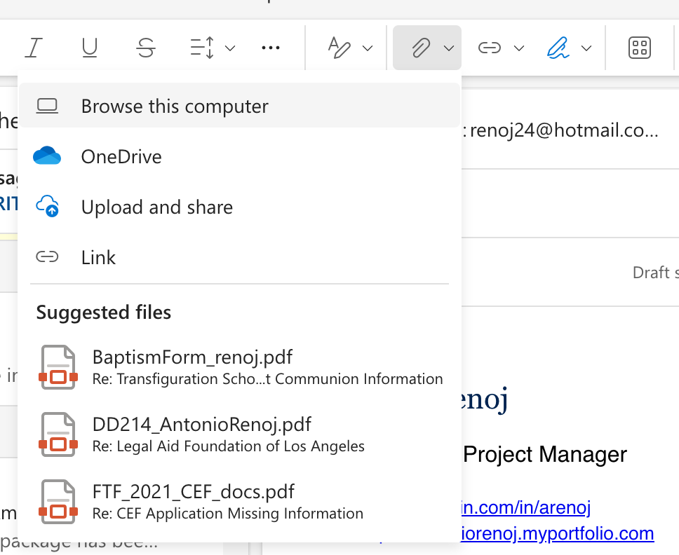
2. File Attachments - Available file preview from sender
File attachment needs to be previewed to ensure correct file is being sent. Each one has a file icon as the preview but being able to see how they will appear to the receiver would be helpful to diminish secondary guesses. Also, why not add a reminder to attach a file when certain keywords are mentioned in the body of the email to ensure it is composed as intended.

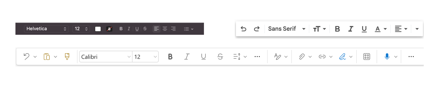
3. Formatting Bar - Available format options
Add a clear indicator of available options for user to choose when formatting emails, easier access as they are typing their email. A standard format to ensure all the tools are available for users and that they are easy to access at anytime they are composing their email.
Feedback
Some of the feedback received has made me rethink about my proposals. Many of my proposals do not have a design centered focus and instead address a problem that is intended for programmers and developers. The initial exploration did have a common thread of trying to get users to compose their emails from start to finish. However, these proposals do not have a design angle to it and I should rethink what I am trying to get users to do from a design perspective.
Next Steps -- I want to look into formatting emails as an integration for a composer window. Having people be able to customize their standard email setup with various profiles to fit their needs and personality. This came as a suggestion from the advanced formatting tools and something that I had not initially consider.
03.22.24
Pivot
After some feedback and discussion of my initial proposals, I decided to focus on the formatting issue that current email faces. Further research was needed to learn more about the current state of sending emails, the limitations and the future of it. This led me to the Email Markup Consortium, a community-led group of industry professionals working to improve the email experience for everyone.
If text messaging delivery system can evolve to include newer features, why hasn't email? I learned how email is just basically HTML code that can't seem to agree with other platforms. I wanted push that concept and see if we can't at least get the ball rolling in the right direction.
The review of the EMC mission statement made an impression on me and this part made me think about my proposal:
Recipients should be able to easily access the content of every email sent to them, regardless of their device, email client, assistive technology or internet speed.
-Email Markup Consortium Mission statement
Quick SWOT
Strengths: Customization of signatures is available on most email clients. Able to create multiple columns by using Table or CSS Grid in HTML. Accessibility is key to all email clients.
Weakness: No one is following standards Different approaches strip out information from some email clients. Still adheres to older email client restrictions.
Opportunities: Allow users to create templates that adheres to email standards. Greater freedom for users to build their brand.
Threats: Not adhering to standards will get in the way of enjoying email platforms. Will lose clients to other communication technologies if user is not able to use it how they want
Updated Proposal & User Flows
Advanced Email Templates
Build on current text formatting options available from signatures and email templates
Build on current text formatting options available from signatures and email templates
By understanding the current limitations, I wanted to Introduce and help establish email standards by adding sections that can be skipped over text reader code.
Placing an emphasis on repeating media, such as the header, footer, signature, and attached files, we can start to build on what the Email Markup Consortium group has put forth to the world of email.
I wanted to add new sections that comply with future email standards but also push the boundary of these standards. I think we can make email fun to look at without compromising performance by allowing people to create their own templates that advances their own personality.
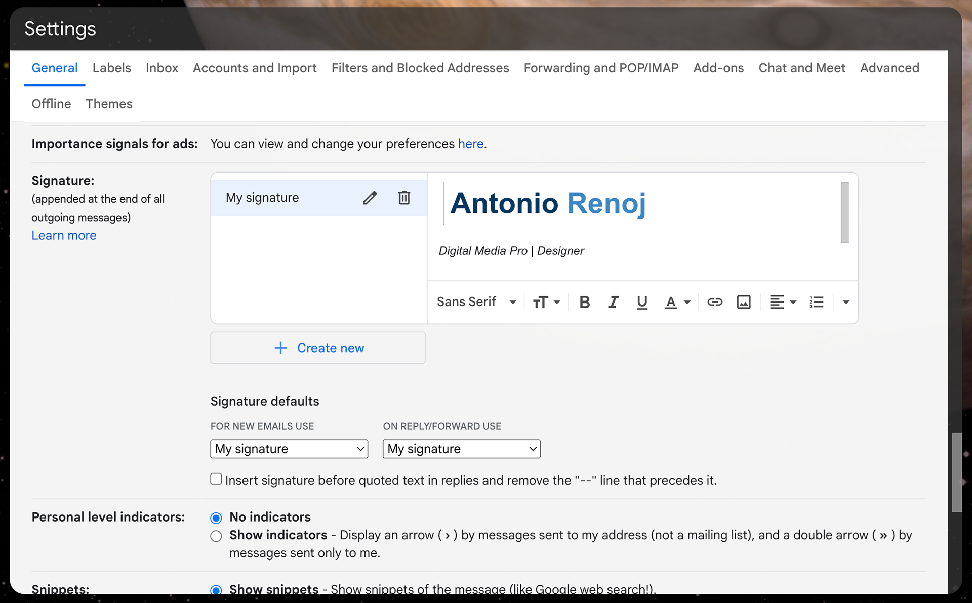
The current look of email signature editor in Gmail settings.
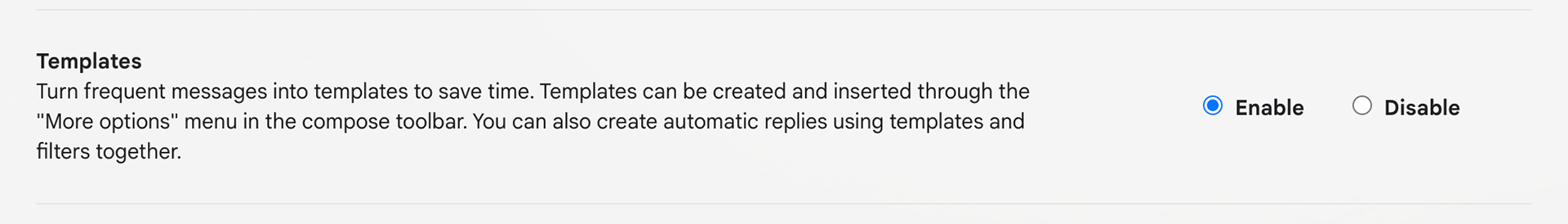
The Gmail settings currently has settings to enable templates, but you have to dig for it in user menus.
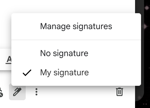
The signature settings can be selected from the options bar at the bottom. With a click of a button, a signature can be added, or removed, to your current email.
User flow
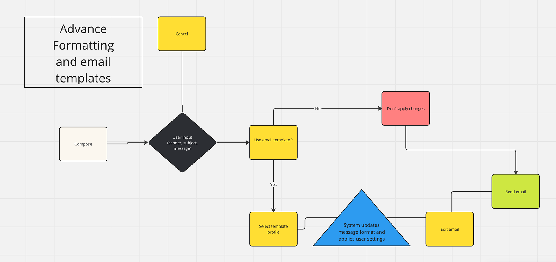
In this proposed user flow map, the decision to use a template should be a fairly simple one that doesn't interfere with the task of sending an email. In this use case, the choice to use a template would be available to the user in the composer window without having to look for it in submenus and options. Choosing to use a template should not affect whether or not you send an email.

Proposed standard email field areas
Additional considerations for standardized fields and settings
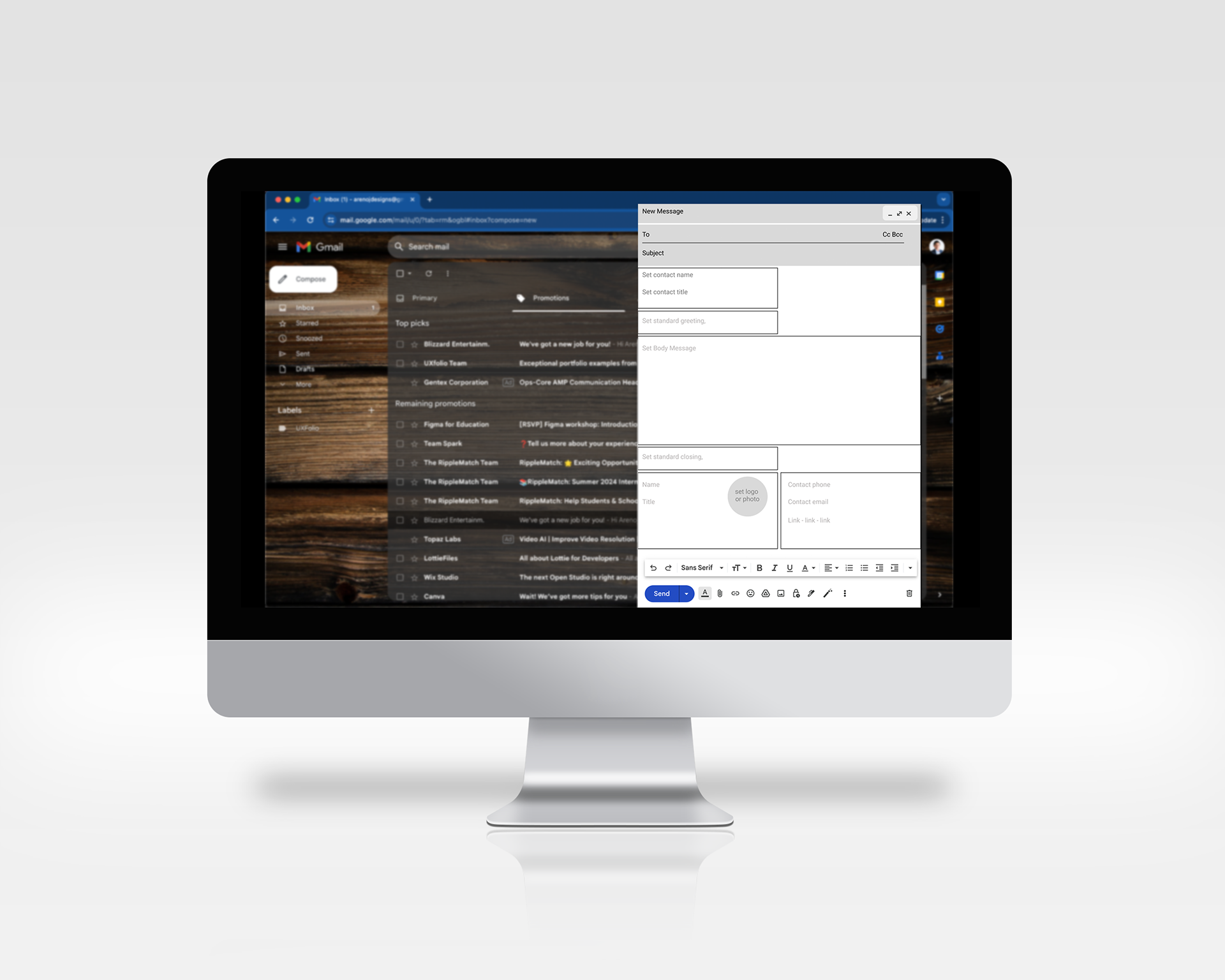
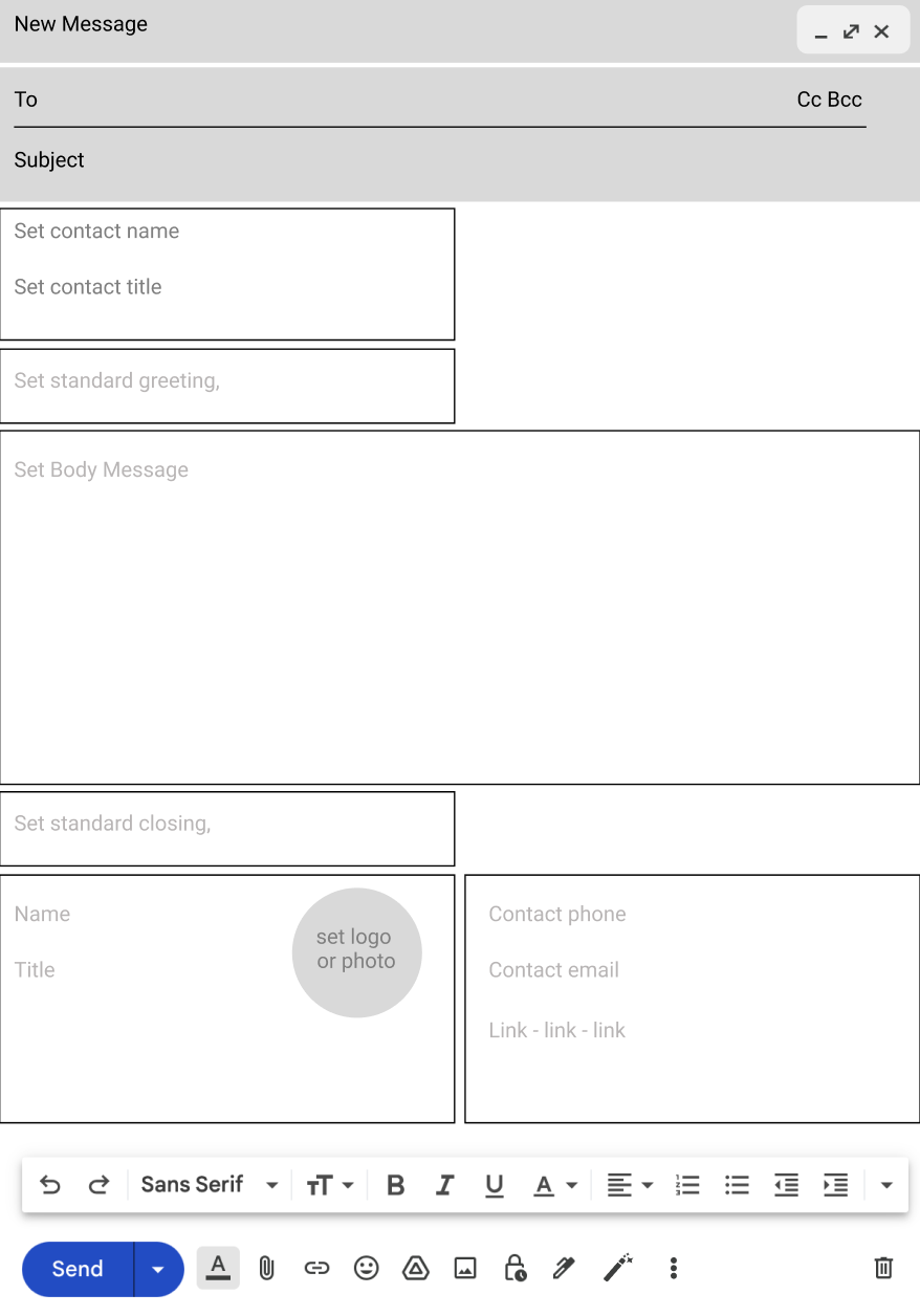
The idea - Magic Templates

An early iteration of the icon that indicates that plan text can be turn into customized settings.
03.28.24
This pivot into the project made me realize a couple of things that my solution needed to consider for it to be useful in email composition:
- Enhance email design and functionality.
- Empower users with ways to set their brand and style.
- Adopt standards that make it easier for people to use templates.
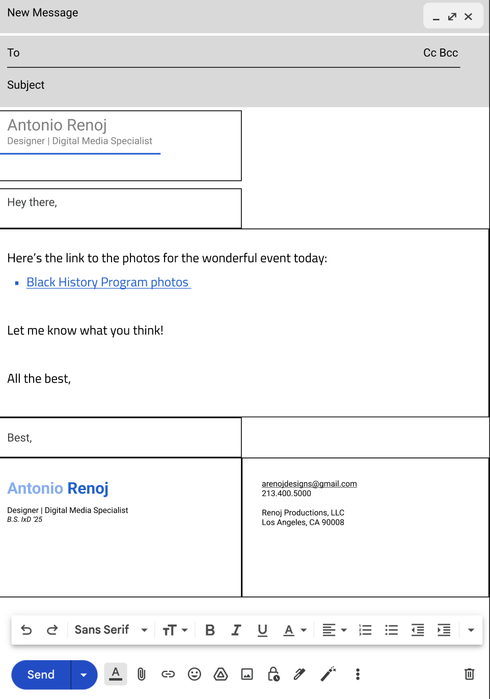
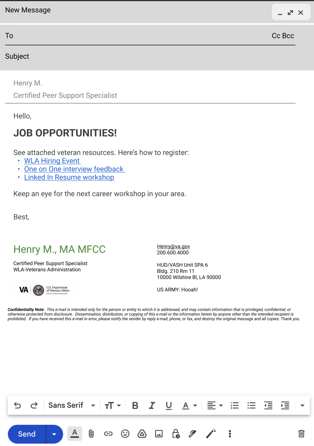
A view of all the template fields filled in as set by a user.
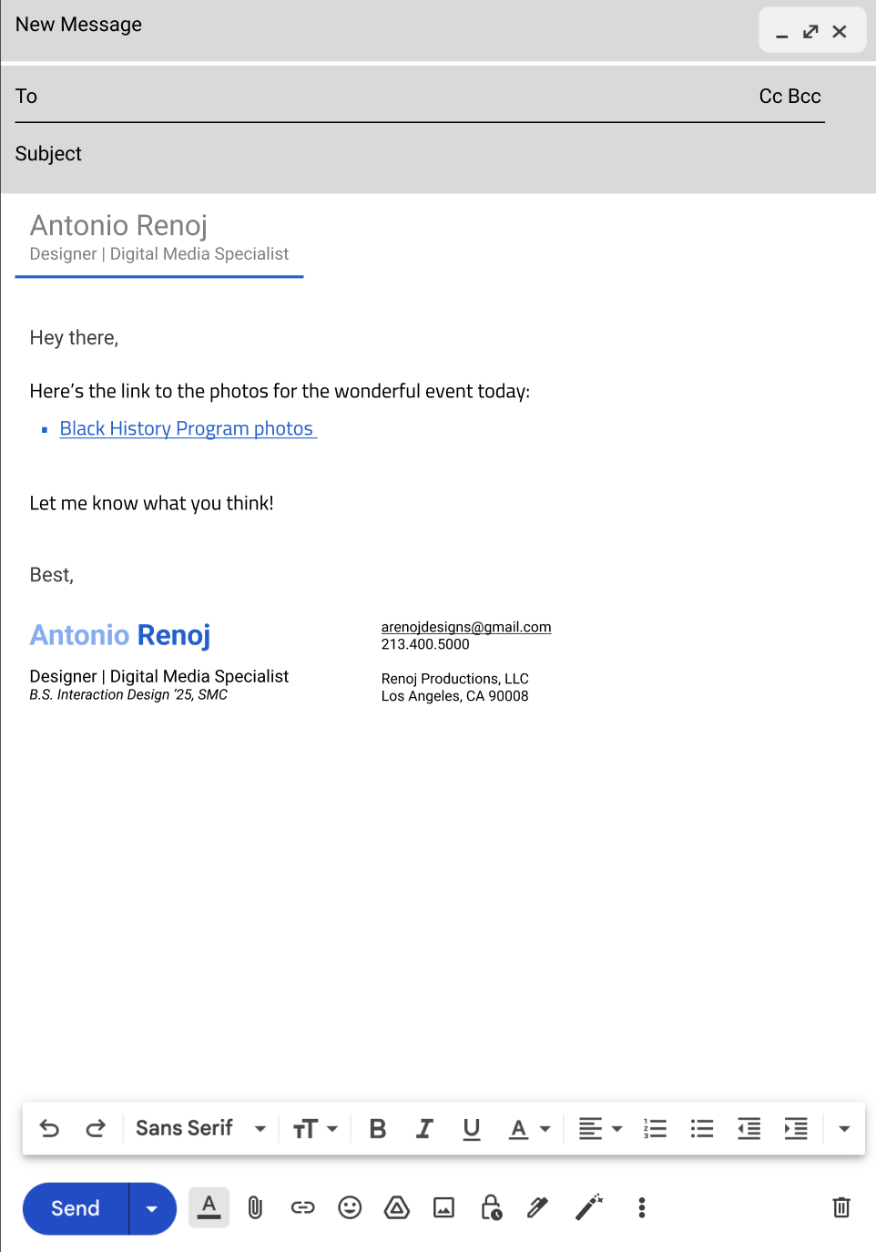
The final view of cleaned up template, adjusting the spacing according to the window -- the idea is similar to Flex-box-wrap from CSS.
I added a template button to the formatting options bar so that it is available to use in one click. By clicking the template button, the user can choose to apply a template or to go into the template editor mode that allows them to set their standard settings for quick responses down the road.
I envisioned that users can set their branding and general language that they can choose to use either before or after composing a message. The inclusion of a header is something that has not been adopted because of the implications in current design and coding restrictions. However, I think that the header could be regarded as something that is purely visual and could be generally ignored by existing restrictions. Because the header does not really contain any new pertinent information (It already exists in the email signature), I think that ignoring it in text readers and code striping is acceptable. In order for this solution to be inclusive to all types of devices, adding another layer of branding for some users and not others does not exclude them from ingesting the message of the sender.
Additional examples
Below are some examples of how these templates can make it easier for a receiving user to find the most important information at a glance. These are some real world examples edited to fit within the proposed the template that carries each of these individual's branding a step forward simply by adding a header and a cleaning up their complex contact information. Additionally, automatic link renaming feature is shown here as many links don't currently get formatted to make sense. I believe the common thinking is that leaving the link as it appears on the browser won't break down as it would if it gets reformatted, which is an incorrect assumption.
The prototype
Try out my proposed email micro interaction for the magic templates.
Final Thoughts and Future possibilities
This prototype helped me to understand what the current limitations are for developing templates, such as the need to exclude CSS files and coding, or creating workarounds for existing code, such as creating columns using tables or CSS Grid code.
Getting the big email clients to agree on a simple solutions or to develop a space for templates is a huge undertaking and it may not be as easy as I imagine it to be. However, providing a vision of how it could work for future email users and a way to add your own personality could make creating emails fun, easy, and keep it professional.
Thanks for reading and if you have any additional feedback or comments, please reach out to me and let's connect!
Tony