BRANDING
Project Summary: Develop a new brand for a health supplement company that focuses on capsaicin as the primary ingredient. Project will include initial research and development of logos, colors, and marketing guide/toolkit. Additional products includes sales and marketing one-sheet, social media assets and website landing page.
Consumer Profile: Health-conscious consumers looking for natural alternatives for pain management and alternative sources for weight loss
Roles: Researcher, Brand Designer, Marketing
Design Tools used: Adobe Illustrator, InDesign, Photoshop, Dimension, Figma, Wix website builder
Design Process
Welcome to one of my favorite branding projects! Read through my process to see how I arrived at my final solutions and deliverables. Beginning with the design process, I researched and learned about my subject. I proceeded to develop a logo and branding guide
Design Research and Exploration
Inspired by the research work I did on capsaicin for a health and nutrition class, I wanted to work on the idea to brand a product that is not well known but has a lot of benefits. The natural irritant of a hot pepper makes a great health supplement and pain reliever. I researched the market and found a small niche audience that I could appeal to so I moved forward with the idea of using capsaicin as my muse.
Identity and Logo
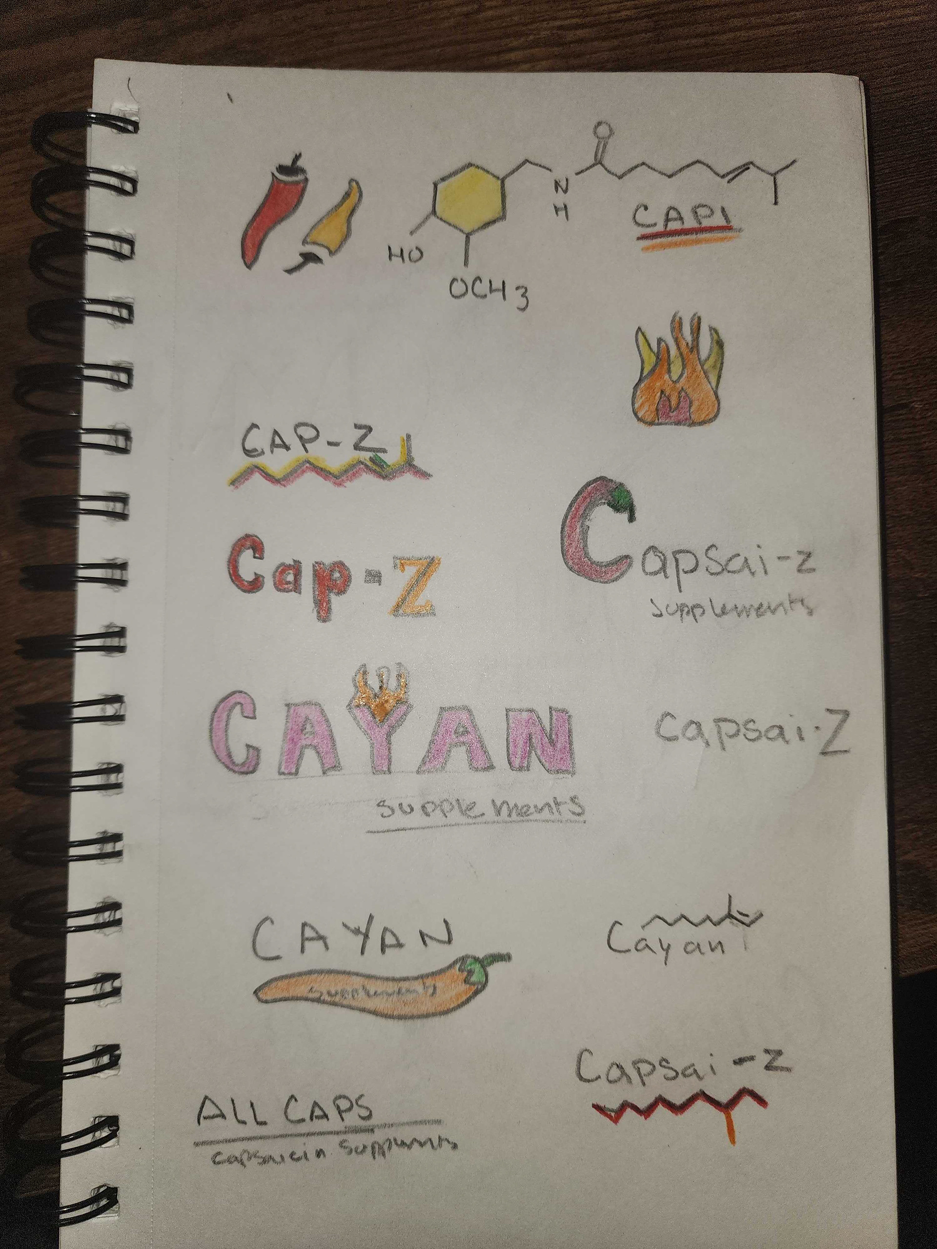
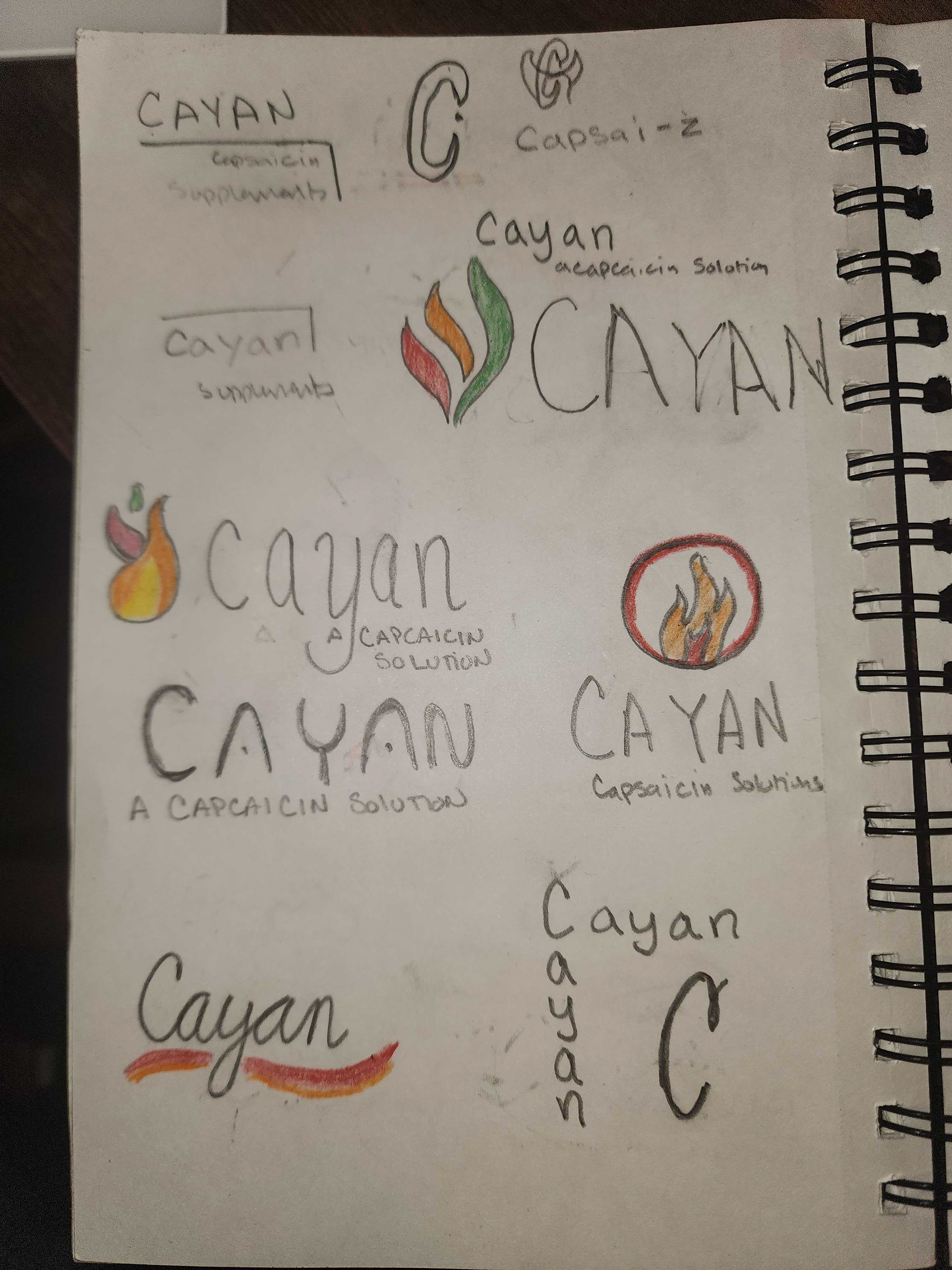
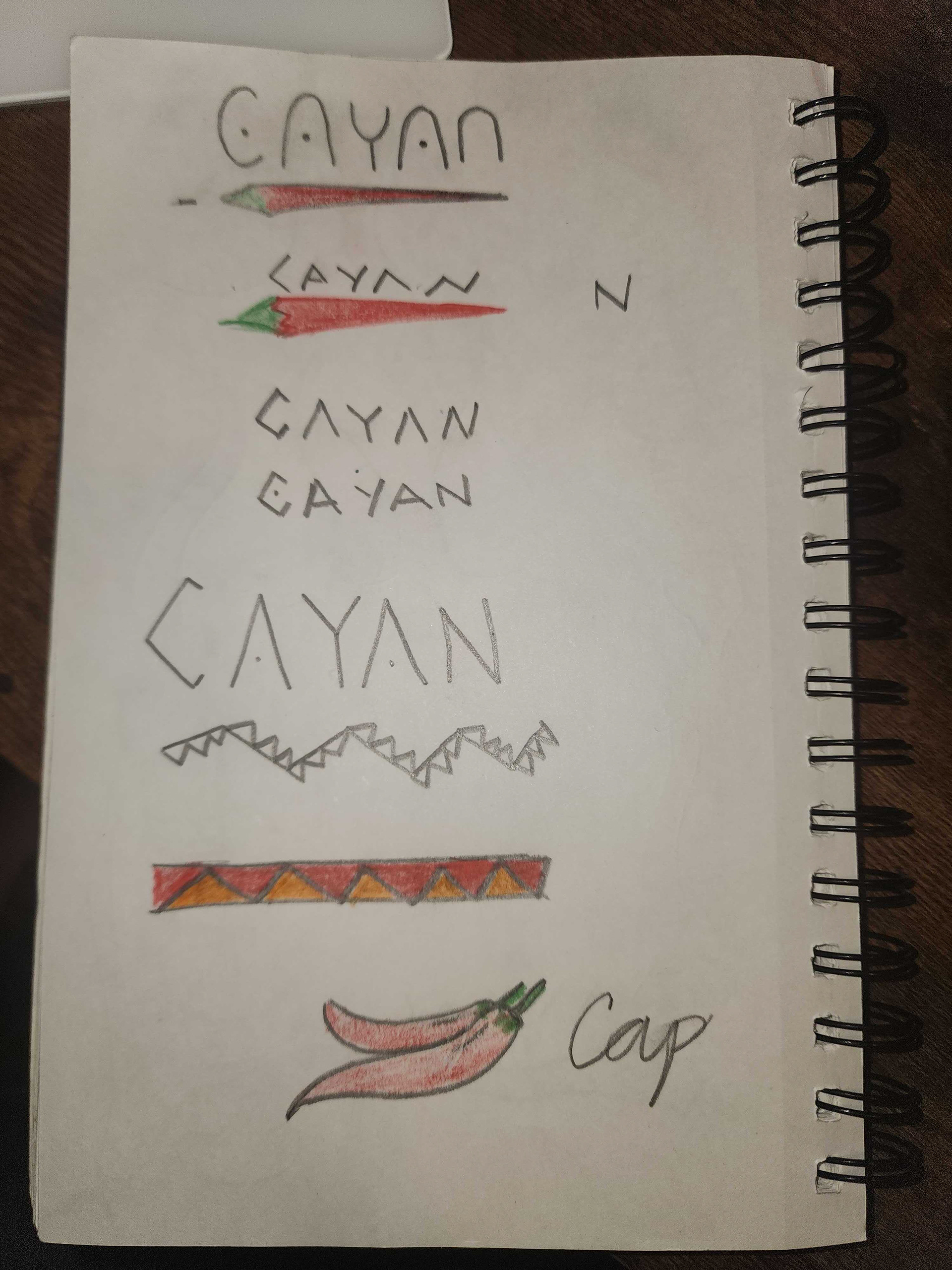
I began to sketch out a bunch of ideas, researched existing companies, and learned all about peppers and the star of my company, capsaicin. A lot of ideas centered around peppers, heat, and the chemical compound shapes. Playing around with triangles and hot color palette, I started to hone in on the strongest candidates for a logo.
I pivoted away from my initial idea of using Capsai-Z, and landed on Cayan. It’s a play on cayenne pepper, and it just sounds so smooth.
Cayan - A Capsaicin Solution
This was my final choice for a logo and the theme that would go on to lead the rest of my design materials. Using a fiery palette from peppers, I chose a flame logo mark and a pattern inspired by Native American art.
I began to expand on the initial direction a bit further and slowly my brand was beginning to take shape. The use of the pattern and the flame icon across materials was meant to keep consistency. The use of red was elevated to the primary color because it is a bold statement and it just naturally captures one’s attention at a glance.
Fonts used: Megrim (primary), Niramit (secondary)
Color palette: Yellow, gold, orange, red and green peppers!
Packaging Process
Deconstruction and Research
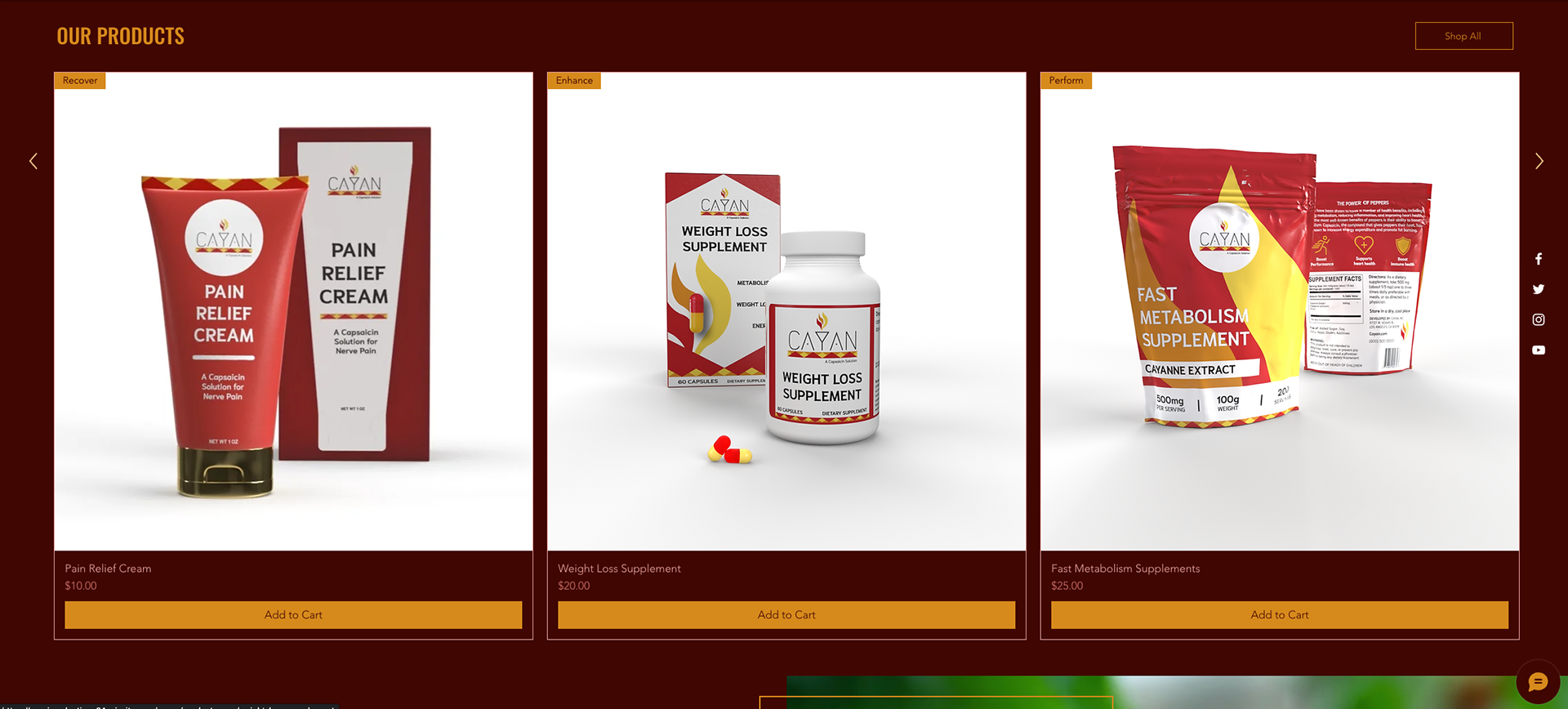
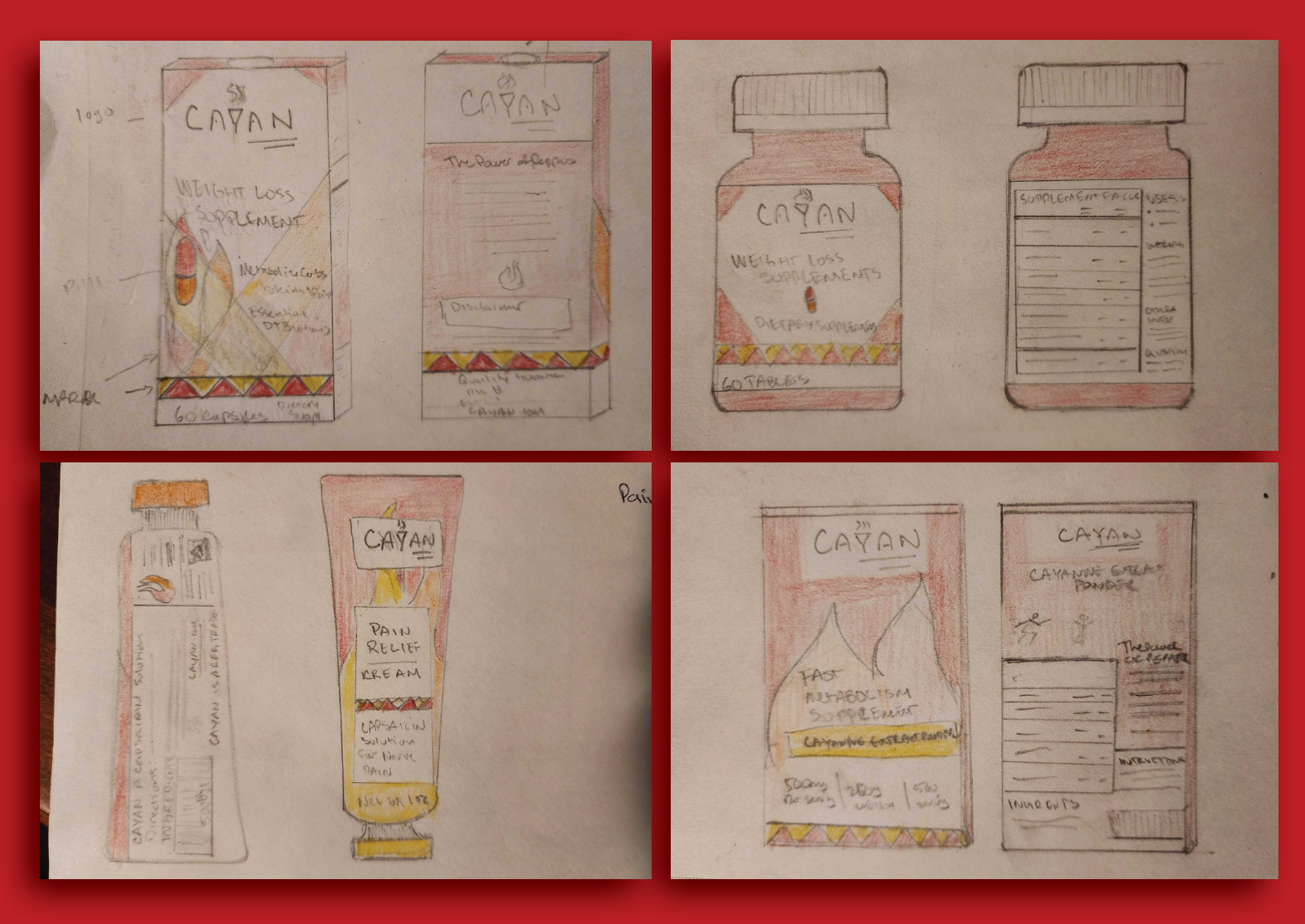
I sketched out ideas on how I was going to apply the brand to actual items. After conducting additional research on capsaicin products, I decided to work on 3 products that this company will offer: a weight loss supplement, a fast metabolism supplement, and a pain relief cream.
After deciding on the products, I started working on the product packaging. I chose to create a pill bottle and box for the capsule supplements, a powder pouch for the powdered supplement, and a cream bottle and box for the relief cream. These die cut guides were created by me after finding online examples and breaking apart real world materials.
This is the final look for the product packaging. The nutritional and supplement facts were based on existing products that have similar uses for what I was going for. The brand colors and theme was important for me to have throughout the packaging, which is very clear in the final look.
My final packaging 3D models were created on Adobe Dimension, stylizing them to look like real life products. Overall, I feel like the branding was strongly represented in these mockups.
Marketing Materials
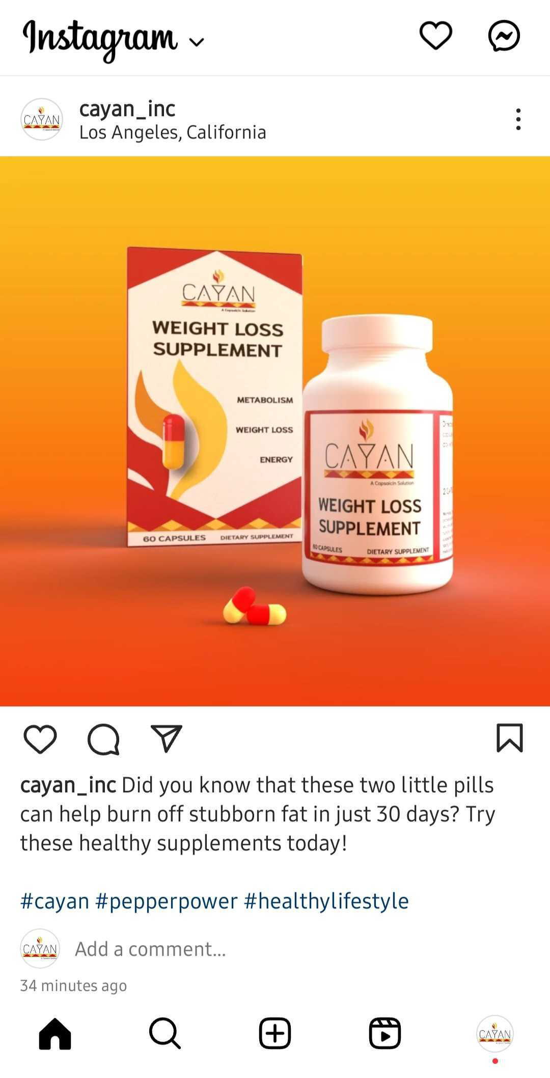
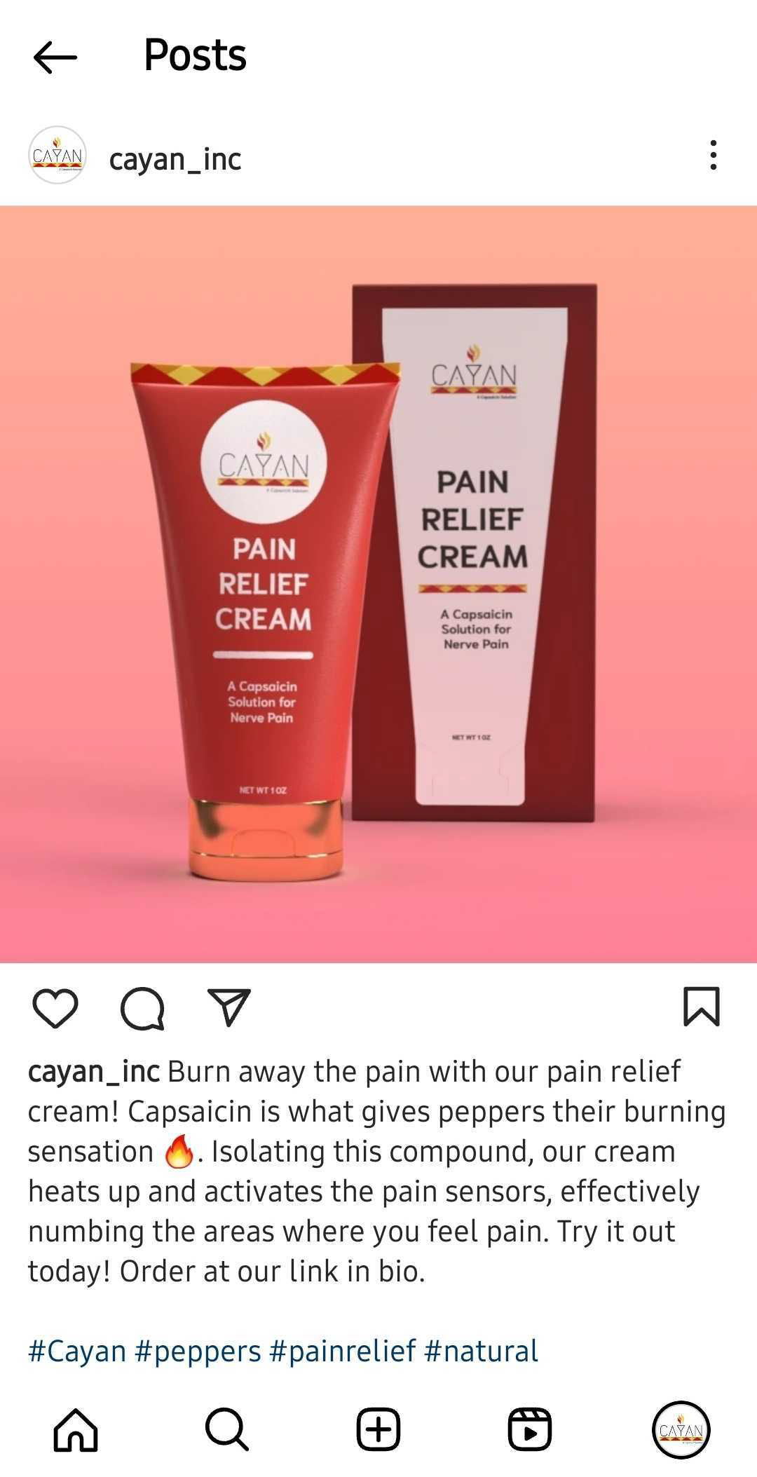
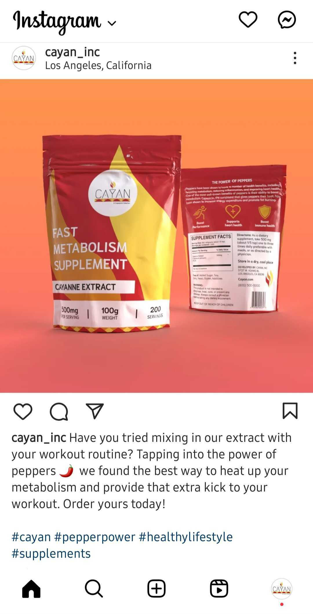
Social Media Profile
The social media profile is important to bring one’s brand to the virtual marketplace, and I introduced Cayan to Instagram by announcing our products and benefits. Complete with a hashtag #pepperpower and #cayan, this brand’s online presence is ready to take off. Posts include the products for sale, lifestyle imagery and even a founder profile.
Check it out on Instagram: @cayan_inc
Printed Materials
The print ad showcased my strongest product which turned out to be the pain relief cream. I felt so drawn to what it had evolved into and I believe that it could really benefit people experiencing different types of nerve and muscle pain. I went back to highlighting capsaicin and the use of peppers and fire.
The final sell sheet was the most brightest and eye catching one. I finalized and incorporated the pricing information, product benefits, the 30-day guarantee and the contact info. I created the pricing based on competitor prices and existing products.
Website
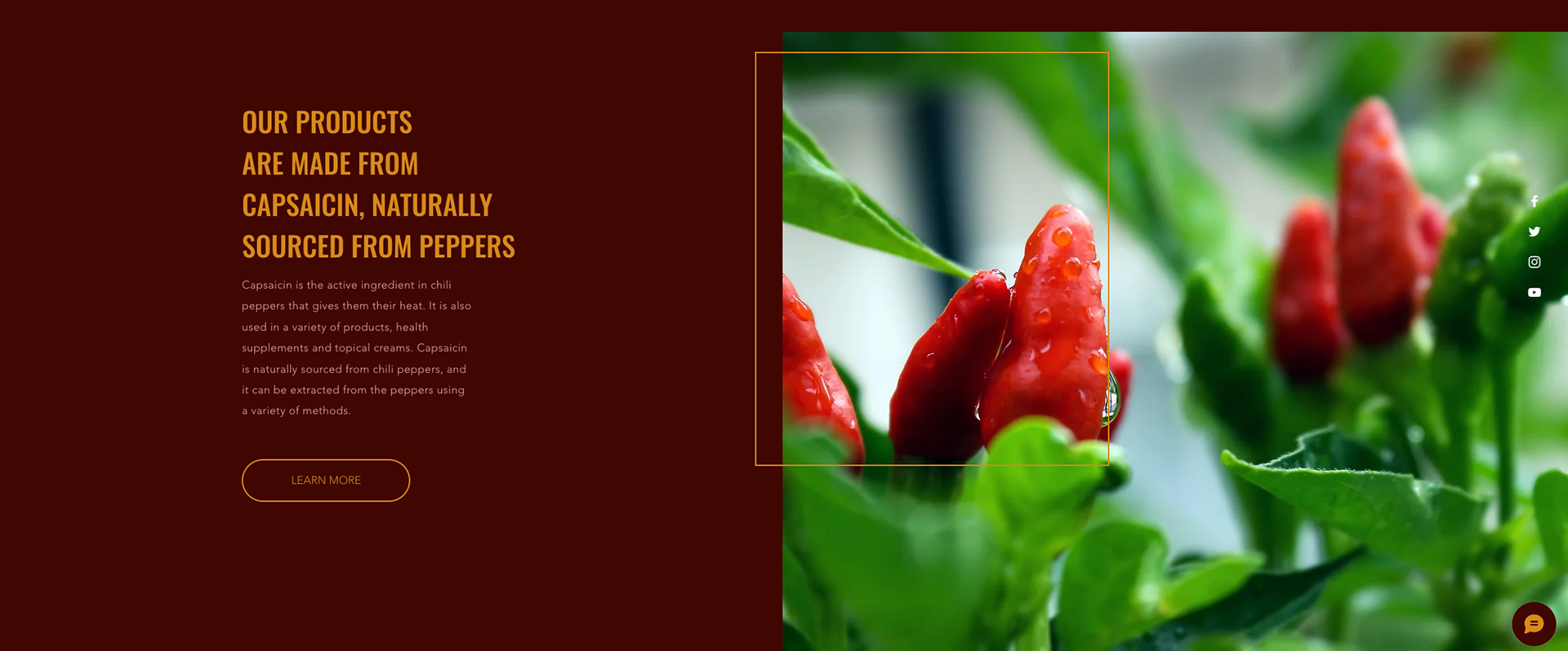
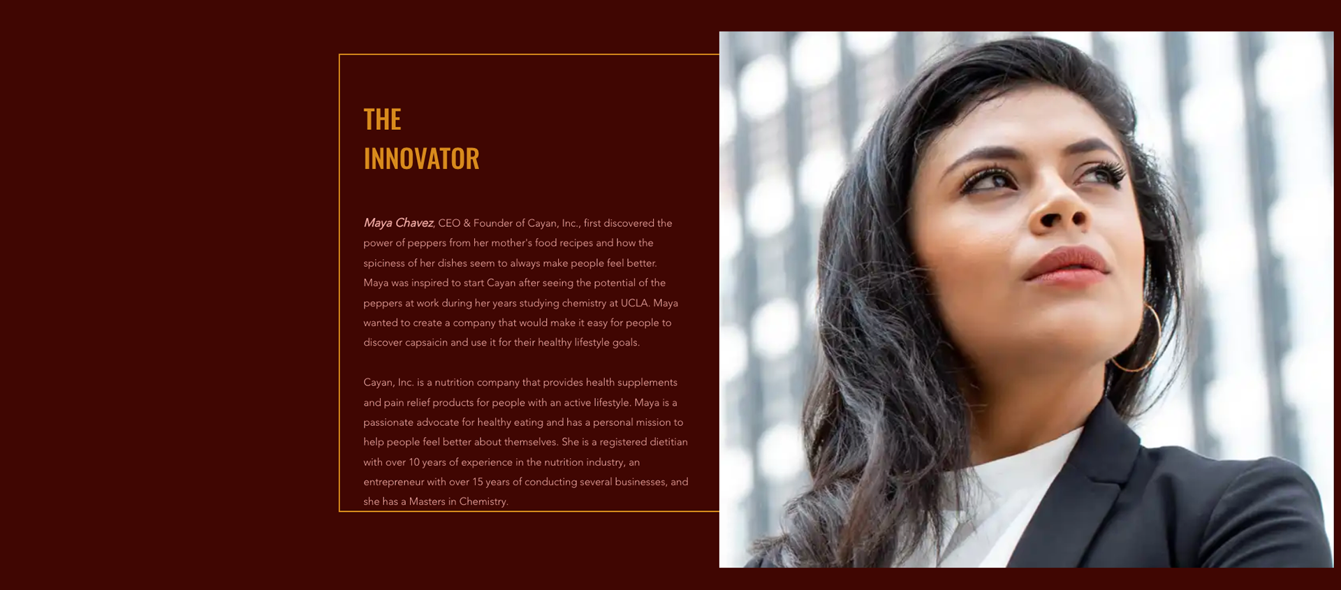
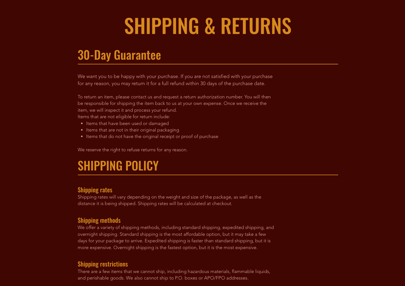
I had a lot of ideas for the website and countless ways to approach a site for my company. But with the brand and identity settling in, I wanted to keep with the strong use of red and warms colors, highlighting the benefits and convey the power of peppers in each product. It was important to showcase the products for sale, provide additional information, and highlight the 30-day guarantee on all products. Adding a few more details like lifestyle images was also important to sell the products to that niche audience.
